1
2
3
4


Rebrand of an existing construction consulting company specializing in redevelopment of interior architecture in the private sector.
Branding by Britt Tapsall
Monogram
Kirkpatrick Construction Consulting approached me about updating an old logo to celebrate a new restructuring of their consultation company. They wanted the initials of their company included in the logo, so after a few iterations, we decided on a "K" with a 3-dimensional quality that reflects an intersection of exposed wooden beams.
Full logo - Monogram and logotype
To offset the solid weight of the logo, wed use softer and lighter colors on a solid dark background. We used Montserrat (designed by Julieta Ulanovsky) for the logotype which also served as the base shape for the "K".
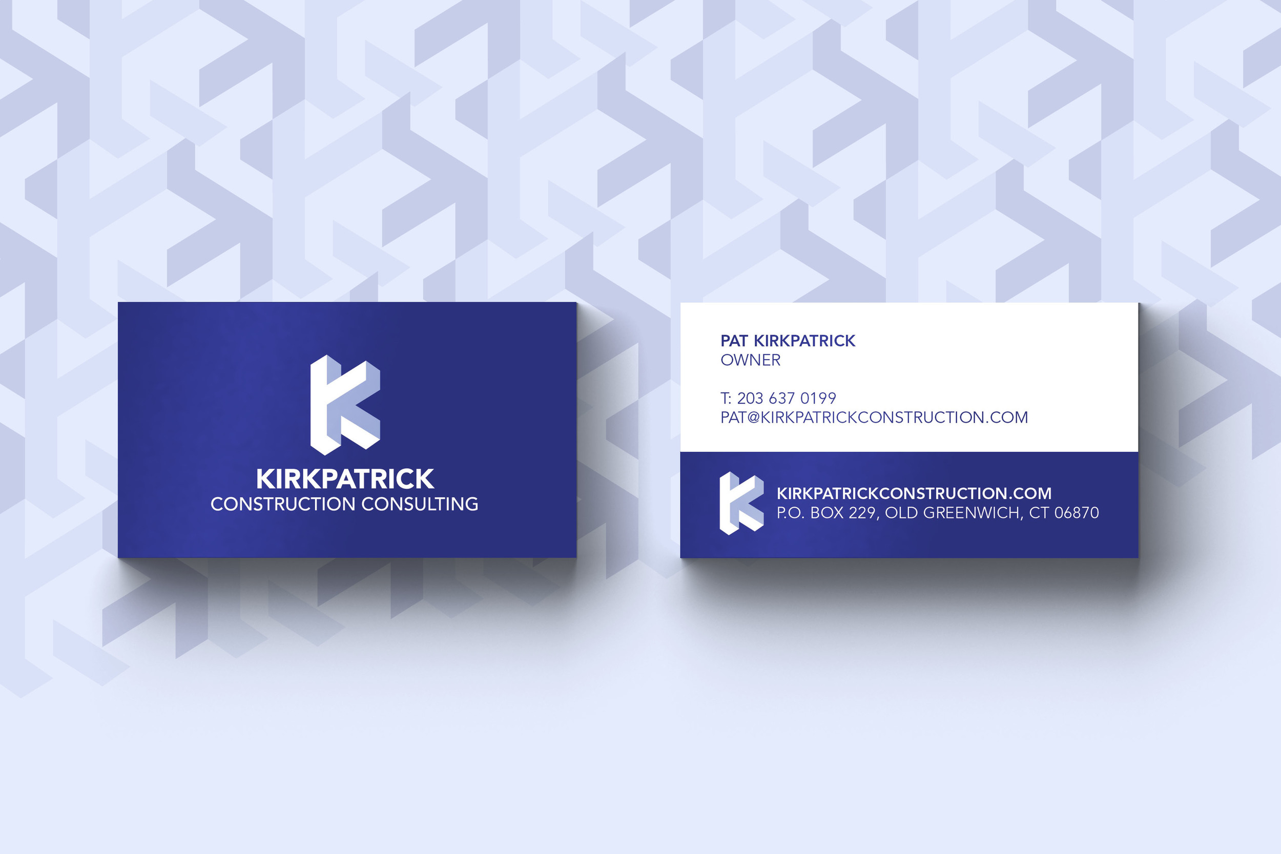
Business Cards
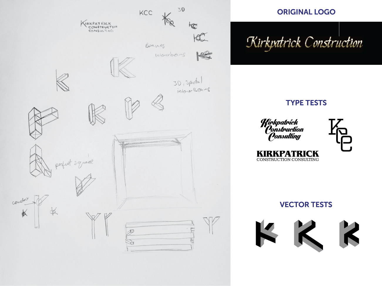
Process
Sketch phase, original logo, preliminary iterations.